BABYMONSTER‘s new teaser for their upcoming digital single has provoked divided reactions from netizens.
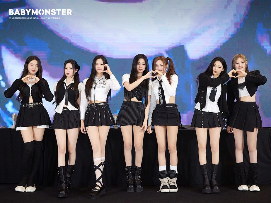
Since debuting (and re-debuting), BABYMONSTER have been killing it with their releases.
After the success of “SHEESH,” BABYMONSTER have been teasing a comeback with a new digital single called “Forever.” The first teaser had fans intrigued as it showed off a fairytale concept.
#BABYMONSTER TITLE ‘FOREVER’
Digital Single [FOREVER]
✅2024.07.01 0AM (KST)#베이비몬스터 #DigitalSingle #FOREVER #TitlePoster #20240701_0AM #YG pic.twitter.com/pwExCpaBwU— BABYMONSTER (@YGBABYMONSTER_) June 18, 2024
On June 21 (KST), the next poster was shared with a very different vibe.
This teaser was styled in the format of a magazine with the members at the center and a variety of text blocks scattered with information about the track, including the song credits and small details like barcode and copyrights.
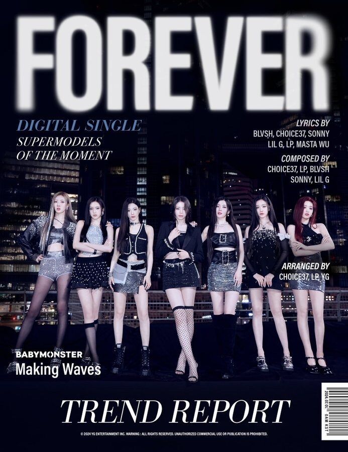
When the photo was posted, netizens had very mixed reactions to the design. Although some didn’t see an issue and thought it was a reason to hate, many netizens hit back at YG’s lack of innovation and creativity when it came to the teaser and how it didn’t do the members any justice.
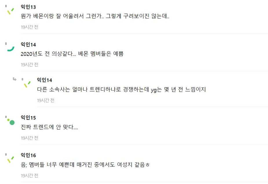

- Maybe because it suits the theme well? It doesn’t look that bad.
- Looks like something from the year 2020… The members are pretty.
- Other agencies are competing on how trendy they can be, but YG feels like it’s stuck a few years back.
- It’s really not in line with current trends…
- Hmm; the members are very pretty, but it feels like a women’s magazine haha.
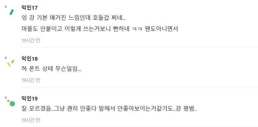
- It’s just a basic magazine look, people are overreacting… It’s obvious those commenting negatively aren’t even fans.
- What’s with the font…?
- I don’t get it… Maybe it’s because people keep saying it’s bad that it looks bad? It just looks average…
- Looks like something I made on PPT…
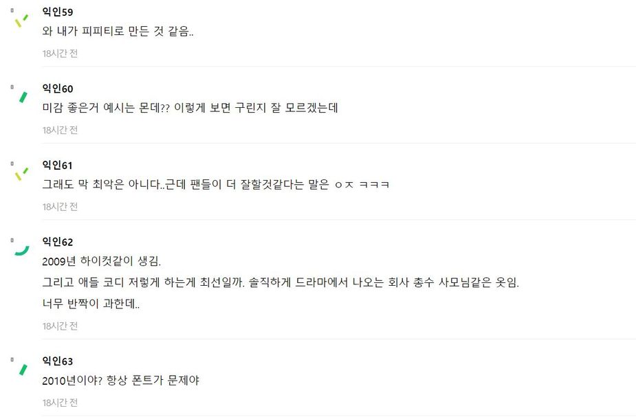
- What are good examples of good aesthetics? It doesn’t look bad to me.
- It’s not the worst… But fans probably could do better hahaha.
- Looks like it’s from 2009 High Cut. And are those outfits the best they could do? Honestly, it looks like something a company president’s wife would wear in a drama. Too much glitter.
- Does it look like it’s from 2010? It’s always the font problem.
- Haha, this is funny. They’re always like this, so now it’s just amusing haha. But they did well, considering YG standards (YG fan here).’
- What’s the problem? It looks okay to me.
- Hire new designers.
It is a very different concept photo from the first teaser, and not all netizens are positive about the design.
Source: Instiz
